SMARTHQ
GE APPLIANCES
ILLUSTRATIONS
Independently, I Initiated and created all illustrations for GE Appliance's only mobile app for smart home control, SmartHQ. I also created design guideline for future GE designers to create illustrations with the same style.
TIMELINE
3 Months
Spring 2024
TEAM
UI Designer
Illustrator
MY ROLE
UI Designer
Illustrator
TOOLS
Figma
Easometric
ILLUSTRATION GALLERY
Experience the whimsical charm of my illustration gallery for the SmartHQ app, where playful, cartoon-style art meets cutting-edge technology. These vibrant illustrations serve as both a visual guide and a friendly invitation, embodying a relaxed, approachable atmosphere that makes smart home technology feel accessible and fun.
ICON GALLERY
Discover the icon gallery, where the playful and cohesive style of our SmartHQ app illustrations is echoed in every detail. These icons, doubling as informative indicators and interactive buttons, blend seamlessly with the illustrations, enhancing the app's unified and engaging visual language.
IN APP
The illustrations and icons I designed are widely used in home page, landing pages, and instruction pages all across the app.
With a more playful and emotional way of expression, these visual designs help to set a friendly and welcoming tone, which is appropriate for a smart home application.


* As shown on GE Appliance's official website
ILLUSTRATION
DESIGN GUIDELINE
This illustration guideline is a concise tutorial for creating SmartHQ app-style illustrations. It includes design specs and step-by-step instructions to ensure consistency in style and presentation.

CANVAS SIZE
1838px * 1378px
The choice of an 1838px * 1378px size is essentially an enlarged version of the classic 4x3 ratio, offering a larger canvas for potential details while maintaining the familiar proportions. Size adaptation also allows for flexibility in different use situations, such as banners or landing pages, where varying proportion ratios can be exceptionally effective and accepted.

STROKE WEIGHT
10px / Rounded Cap / #992C7C

6px / Rounded Cap / #992C7C
4px / Rounded Cap / #992C7C
In our illustration visual guidelines, we use a default stroke weight of 10px for the outlines of shapes, 6px for internal lines, and 4px for detailed elements, all uniformly in #000000 for strong contrast on dark backgrounds. Rounded caps are applied to all lines, ensuring a cohesive and aesthetically pleasing appearance. This approach ensures clarity and consistency across various illustration styles and applications.
STROKE CAPS
& JOINS
Stroke Caps
Joins

Rounded joins are used to work alongside the rounded Stroke cap approach. Bevel joins are also accepted when connecting facets of a 2.5D object. Do not use mitre joins. This is particularly effective in maintaining a consistent style and preventing any harsh or abrupt line intersections.
STROKE
POSITION

In our illustration guidelines, it's essential to always use centered strokes for line work. This approach is particularly important because using inside or outside strokes can create alignment challenges, especially when depicting different facets of 2.5D objects. Centered strokes ensure that the lines remain equidistant from the edges of shapes, providing a balanced and uniform appearance.
COLOR PALETTE

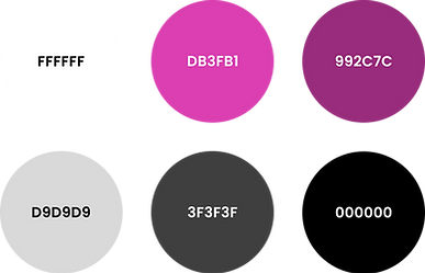
Our illustration color palette, aligned with the SmartHQ App, features #FFFFFF (pure white) for all strokes, ensuring clear outlines. The main color is #992C7C, complemented by #DB3FB1 for highlights. We use #D9D9D9 and #3F3F3F for a balanced gray zone, and #000000 to accentuate appliances and devices. Other colors are also accepted for exceptional uses if match SmartHQ’s color palette.
GRADIENTS
& EFFECTS

In our illustrations, the predominant gradient is the SmartHQ purple gradient, featuring a blend of 20% and 80% #DB3FB1, with the overall layer being non-transparent.
For backgrounds, we use a 70% transparent gradient over a black base, blending #202022 and #303134 for a dark gray effect, lending a contemporary and attractive look to the design.
The glass effect is achieved using a 30% transparent layer of #D9D9D9 with a pronounced 50px background blur, adding depth and sophistication.
2.5D
ILLUSTRATION

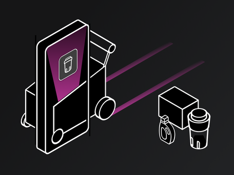
2.5D illustration merges 2D and 3D elements, adding depth while keeping a flat, stylized look. This style is ideal for app illustrations, enhancing sophistication and engagement in the user interface.
EASOMETRIC


To achieve standardized 2.5D illustrations, we recommend using the Easometric plugin. This tool aids designers in transforming flat images and shapes into a perspective view. Avoid manually creating 2.5D illustrations, as maintaining consistent perspective across various designs can be challenging.
USE OF ICONS

For appliance illustrations, it's recommended to utilize the icons from our design system. Employ Easometric to transform these icons into a perspective view and add side panels for a complete 2.5D effect.
However, in cases where the icons are overly detailed for the illustration's purpose, creating simplified versions of the appliances is also permissible.
SKETCHES

When beginning a sketch, it's essential to first grasp the prompt's essence. Identify the key concepts to convey, which may include abstract ideas. The next step is to brainstorm imaginative ways to visually represent these concepts. Creatively merge these elements into a coherent composition. Finally, sketch them in a 2.5D perspective to assess proportion balance before proceeding to the final vectorization stage.
EMOTIONS

In designing illustrations and icons for SmartHQ, prioritizing the emotional impact of the visuals is key. As SmartHQ is a smart home control app, it's vital to create a welcoming and comfortable user experience. Embrace a playful and charming design approach to evoke a sense of pleasure. For illustrations, incorporating a user figure can add life and relatability, making the visuals more engaging and user-friendly.


