top of page


Fitness & Health
Mobile App Revamp
Summer 2025
Contract Project
SUMMARY
The VShred mobile app revamp was a contract project I worked on with Stable Kernel, a design and technology consulting agency. The goal of the revamp was to redefine the brand identity, elevate the user experience, and align the product with the client’s business objectives and marketing expectations.
As the Lead Product Designer, I focused on establishing the visual identity, crafting a seamless user flow, and delivering high-fidelity, page-to-page designs. Throughout the project, I worked closely with developers, clients, and key stakeholders to ensure all technical and business requirements were met—while also pushing the design beyond expectations.
TIMELINE
3 Months
Summer 2025
TEAM
3 Product Designers
4 Developers
2 Project Managers
MY ROLE
Product Design Lead
Brand Identity
Design System
TOOLS
Figma
FigJam

TRANSFORMATION

INFO ARCHITECTURE

01
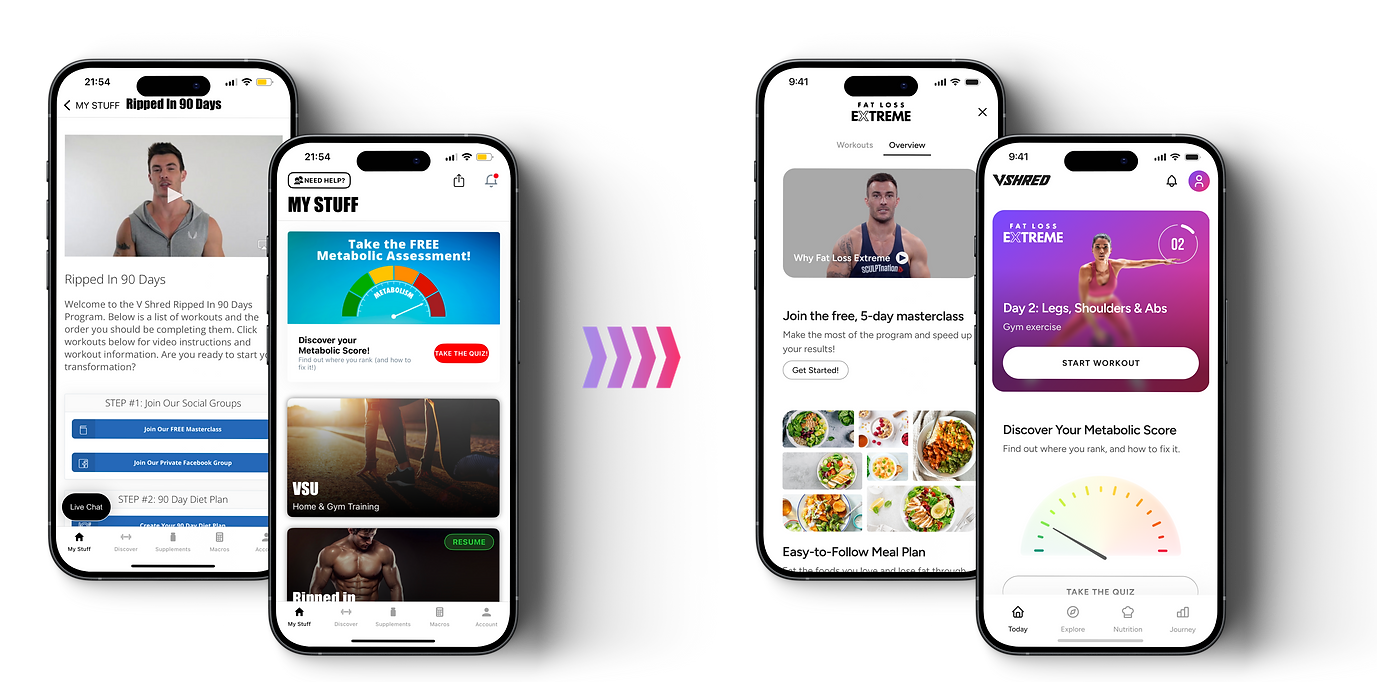
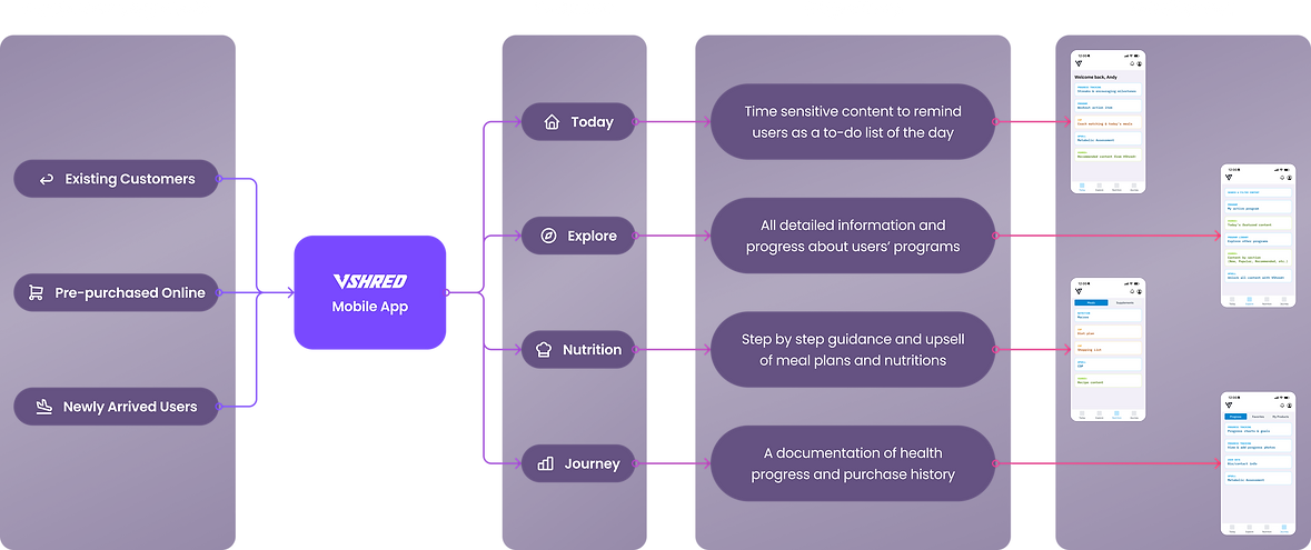
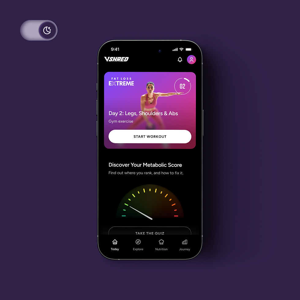
TODAY
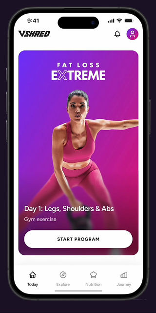
Today's tab displays time sensitive content to remind users as a to-do list of the day.
Feature
02
Feature
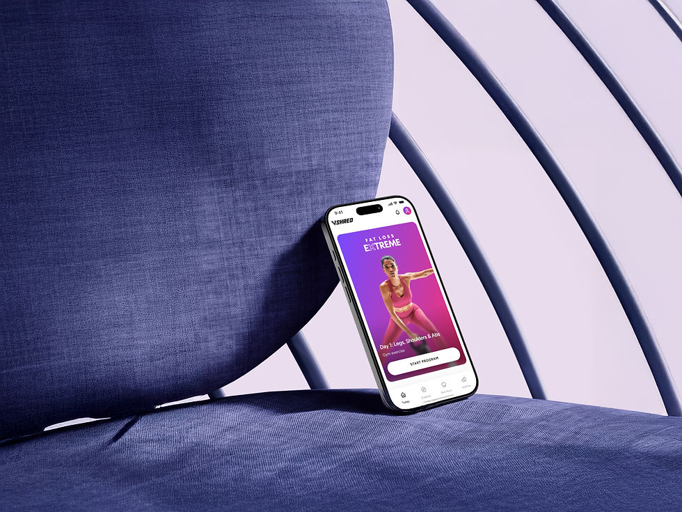
PROGRAM
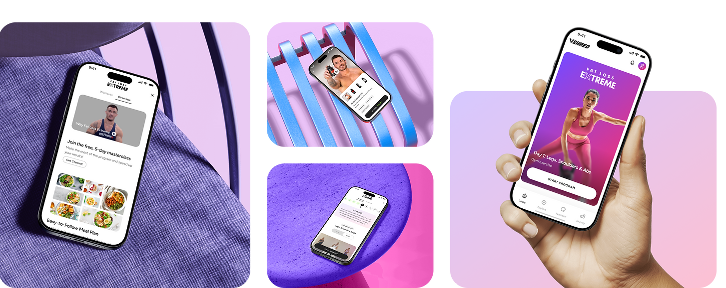
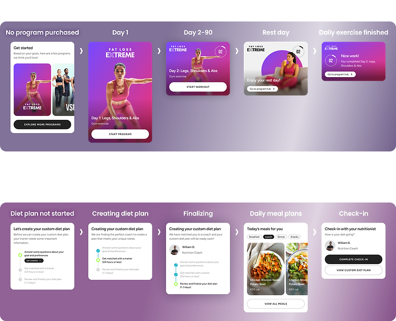
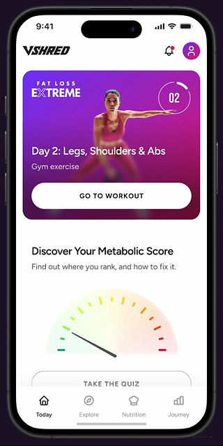
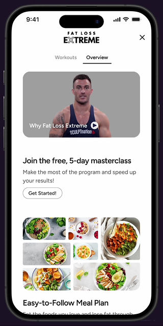
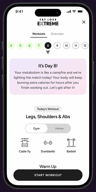
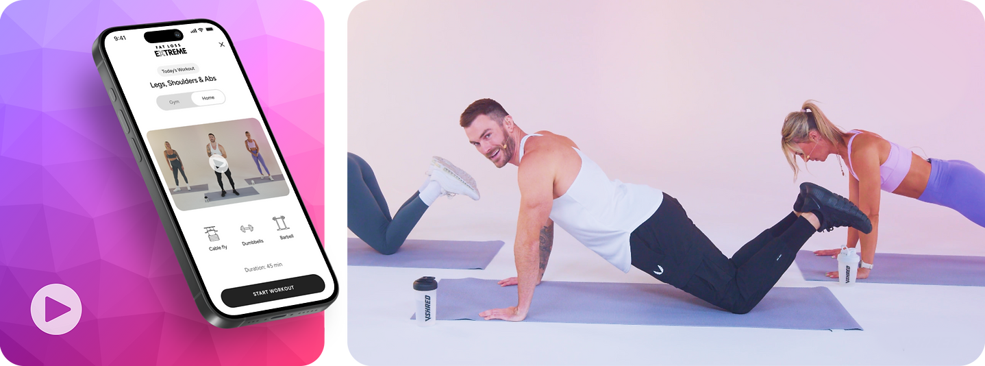
By accessing the Program Hub from Today or Explore tab, users can check today's workout schedule, browse program overview, and start their daily workouts.
Today's Workout
Program Overview
Workout Flow
03
Feature
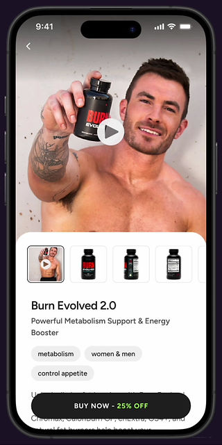
NUTRITION
The Nutrition tab provides step by step guidance and upsell of custom diet plans and VShred branded supplements.

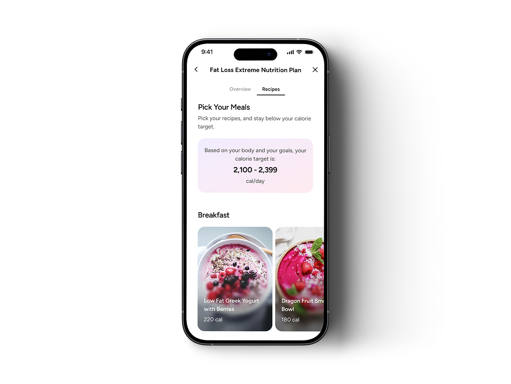
Meal Plans
Supplements
04
Feature
JOURNEY
The Journey tab has access to documentation of health progress and purchase history, and users' overall growth and badges.


1/6
Design Approach
CONTENT
FIRST
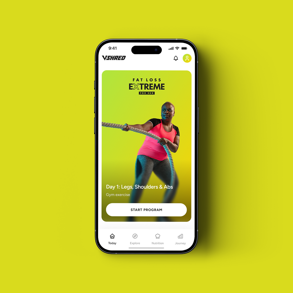
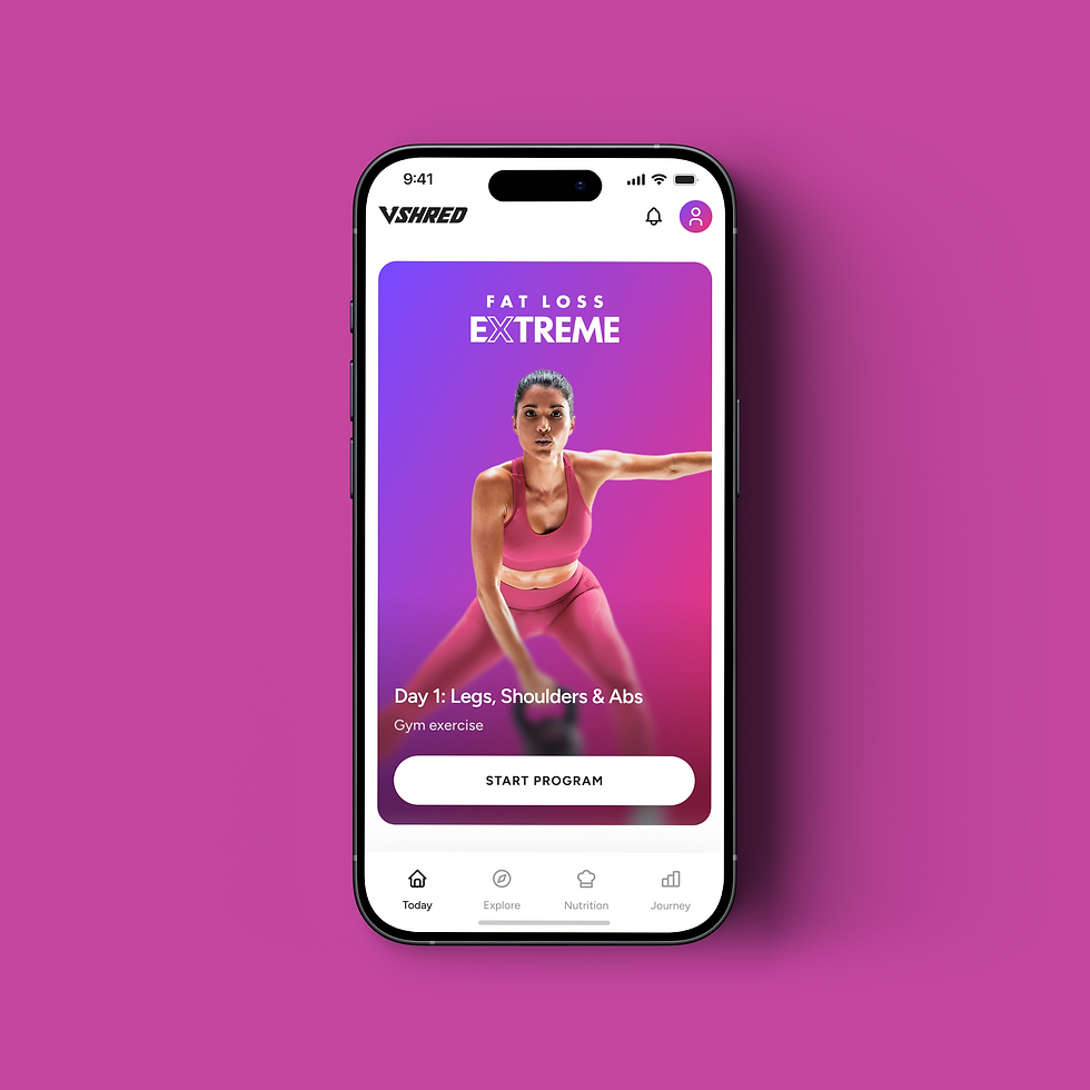
The app uses a muted, neutral-toned UI design instead of brand-color dominance, allowing content images to take center stage. This approach ensures a coherent look that adapts seamlessly to any image color palette.
Design Approach
ATOMIC
SYSTEM
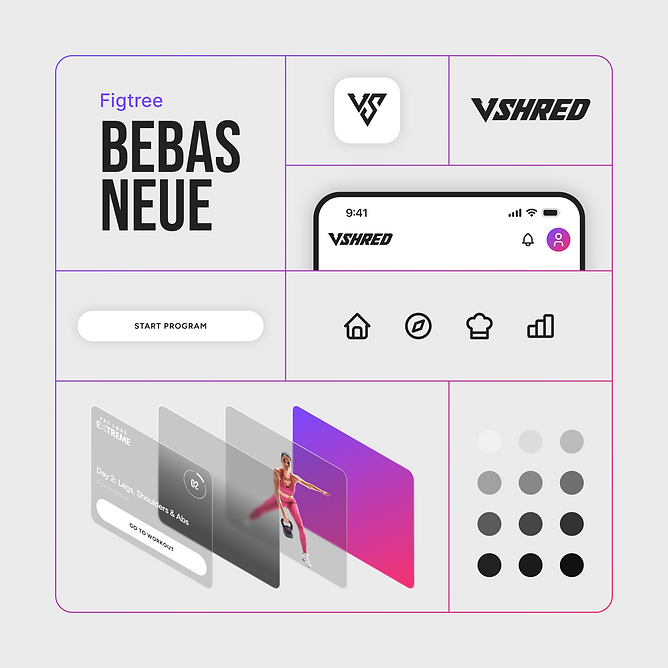
Since this project is starting from the ground up, I adopted an atomic design system to maintain consistency across components and pages while providing a standardized framework for handoff to the development team.
1/2
Design Approach
RESPONSIVE
DESIGN
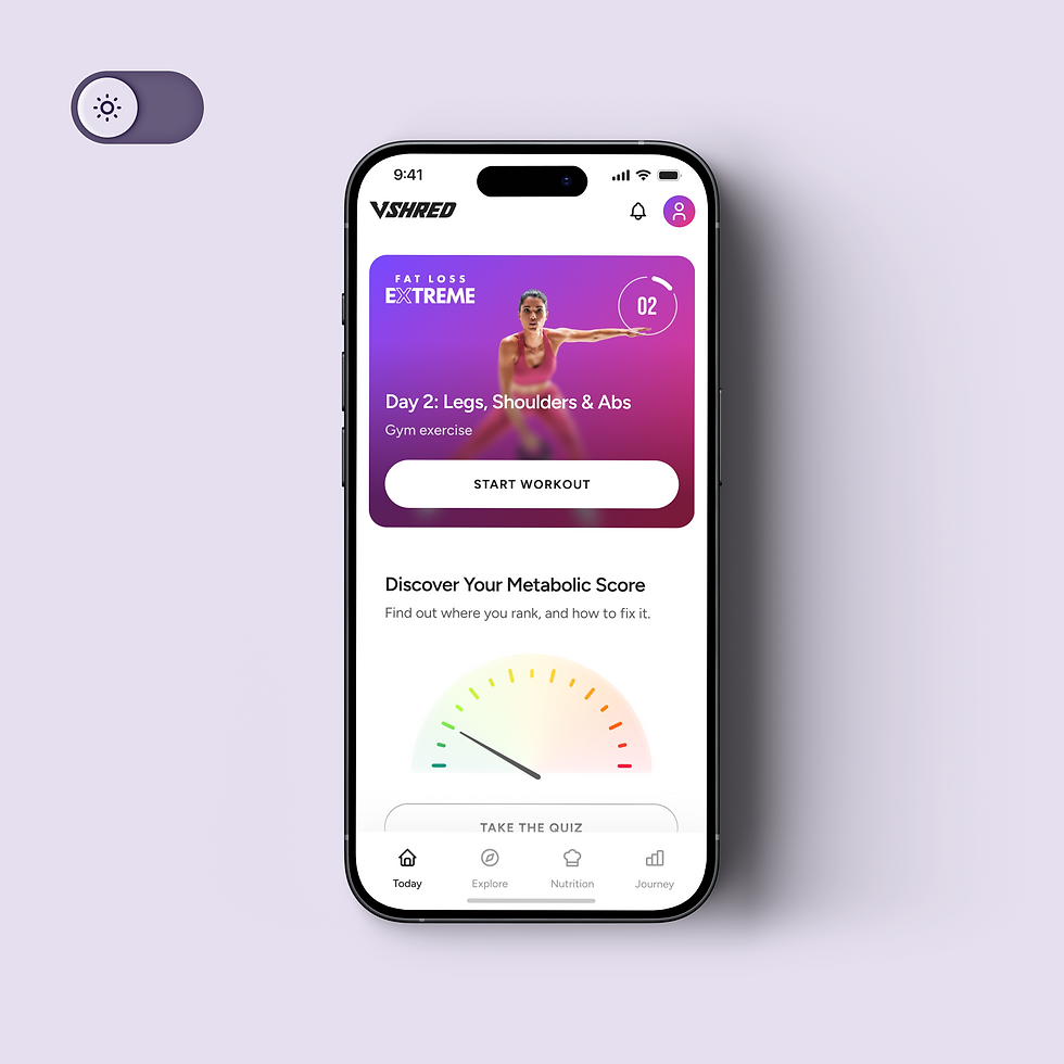
To ensure the product’s accessibility and scalability, the design follows a responsive approach, supporting light and dark modes, adapting to system font size settings, and accommodating multiple languages.


bottom of page